Customize Sayify.pro with your logo, colors, and domain to match your brand.
🎨 Branding
Make every feedback page look and feel like your own product. Sayify's branding settings let you customise logos, colours, layouts, and even your domain — so respondents see your brand, not ours.
All branding options live under Settings → Branding & Domain, organised into three tabs. ✨
Here's what the Branding & Domain settings look like:
🌐 Tab 1 — Domain
Company Subdomain
Every workspace gets a unique subdomain on sayify.pro. Your intake pages are served at:
https://your-company.sayify.pro/i/form-slug
To change your subdomain:
- Type your desired slug in the subdomain editor (lowercase, numbers, and hyphens only).
- Sayify checks availability in real‑time — you'll see ✅ Available or ❌ Not available instantly.
- If taken, suggested alternatives are shown as clickable chips.
- Click Save Subdomain to apply.
Your current live URL is always displayed below the editor with a quick‑copy and open‑in‑new‑tab button.
Custom Domains (Coming Soon)
Soon you'll be able to serve intake pages from your own domain — like feedback.yourcompany.com — with automatic SSL and multi-domain support.
🖌️ Tab 2 — Branding
This is where you define your visual identity. Changes show up in a live preview panel on the right side of the screen — so you can see exactly how your intake page will look before saving.
Brand Identity
| Setting | What it does |
|---|---|
| Brand Name | The company name displayed on your public intake pages. |
| Logo | Your logo, shown at the top of the intake page. Upload PNG, JPG, WebP, or SVG (max 5 MB). |
| Favicon | The small icon that appears in the browser tab. Upload PNG, ICO, or SVG (max 1 MB). |
Both the logo and favicon have a clear button (✕) so you can remove them and fall back to defaults.
Colors
| Setting | Default | What it affects |
|---|---|---|
| Primary Color | #6366f1 (indigo) |
Buttons, links, accents, and the recorder button. |
| Accent Color | #8b5cf6 (violet) |
Progress bar, secondary highlights, and gradients. |
Each colour has a colour picker swatch and a hex input — use whichever is faster for you.
Background Style
Choose how the page background looks:
| Style | Description |
|---|---|
| Gradient (default) | A smooth gradient built from your primary and accent colours. |
| Solid Color | A flat colour background. |
| Background Image | Upload a custom background image. |
Button Style
Controls the shape of the voice recorder button:
| Style | Shape |
|---|---|
| Rounded (default) | Slightly rounded corners — looks clean and modern. |
| Pill | Fully rounded, capsule shape — wider and friendlier. |
| Square | Minimal corner radius — sharp and professional. |
Header Layout
| Option | Description |
|---|---|
| Left | Logo and title aligned to the left — great for B2B and corporate pages. |
| Center | Logo and title centred — ideal for consumer‑facing forms. |
Powered By Badge
Toggle the "Powered by Sayify" badge on or off. It's shown by default, but you can hide it for a fully white‑labelled experience.
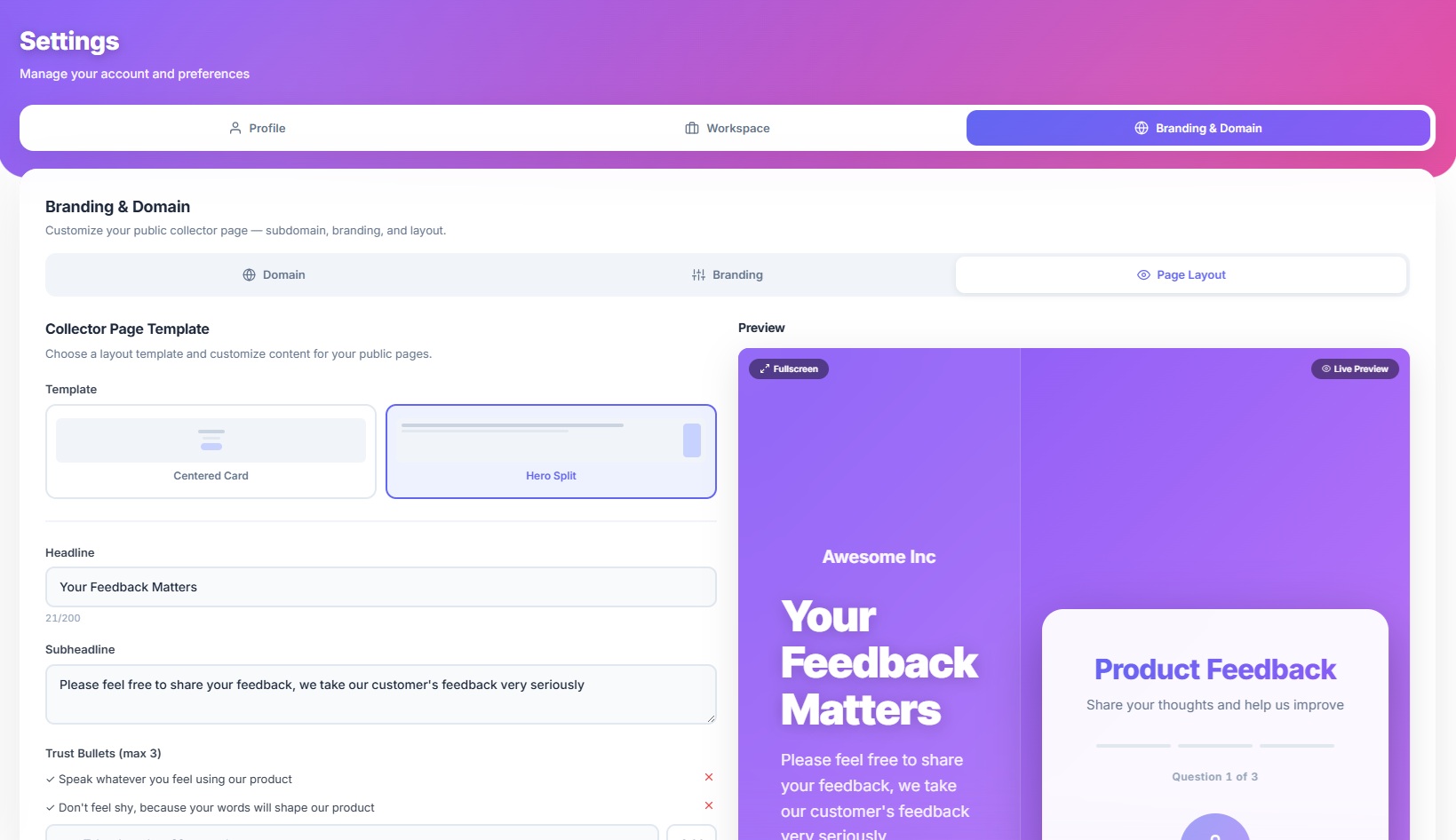
🖼️ Tab 3 — Page Layout
Choose a layout template for your public intake pages. Like the Branding tab, changes are previewed live on the right — and you can click Fullscreen to see a full‑size preview.
Centered Card (default)
A clean, focused layout with your form content inside a centred card. Best for simple, quick intake forms where you want the respondent's attention on the question.
Hero Split
A two‑column layout with a hero panel on the left and the form on the right. Perfect for B2B use cases where you want to set context before the respondent starts speaking.
When you select Hero Split, additional settings appear:
| Setting | What it does |
|---|---|
| Headline | Large bold text on the hero panel (max 200 characters). |
| Subheadline | Supporting text below the headline (max 500 characters). |
| Trust Bullets | Up to 3 short confidence‑building statements (e.g. "Takes less than 60 seconds", "100% anonymous"). Shown with ✓ checkmarks on the hero panel. |
🔀 Where Branding Applies
| Surface | Logo | Colors | Subdomain | Layout |
|---|---|---|---|---|
| Intake Pages | ✅ | ✅ | ✅ | ✅ |
| Email Notifications | ✅ | ✅ | — | — |
| Dashboard | — | — | — | — |
Your branding only affects respondent‑facing surfaces — the dashboard and admin views always use the standard Sayify theme.
👁️ Live Preview
Both the Branding and Page Layout tabs include a Live Preview panel that updates instantly as you adjust settings. You can:
- See your logo, colours, button style, and layout reflected in real‑time.
- Click the 🔲 Fullscreen button to preview at actual size.
- Press Escape to exit fullscreen.
This means you never have to save-and-check — what you see in the preview is exactly what respondents will see.
💡 Tips for Great Branding
- Match your brand palette — Use your actual brand colours for primary and accent to create a seamless, on‑brand experience.
- Use a transparent PNG logo — Looks best on both gradient and solid backgrounds.
- Keep the favicon square — 256×256px or larger is recommended for sharp rendering across browsers.
- Try Hero Split for B2B — If you're collecting structured feedback from clients or employees, the hero panel gives you space to set context and build trust.
- Preview in fullscreen — Always check the fullscreen preview before saving. What looks fine in the mini preview might need tweaks at full size.
- Hide the badge for white‑label — If you're embedding Sayify for enterprise clients, toggle off the "Powered by Sayify" badge.
🎓 What's Next?
- Intake Page — See how branding appears on the respondent‑facing page.
- Templates — Browse pre‑built form templates.
- Key Concepts — Review all platform building blocks.
- Inbox — Manage responses after they come in.