Everything about the public voice intake page — what your respondents see, how the flow works, and how to make it yours.
🎙️ The Intake Page
The intake page is the star of the show — it's the beautiful, distraction‑free page where your respondents record their voice feedback. Every intake link you create automatically generates one of these pages, ready to share.
Respondents don't need a Sayify account. They just open the link, speak, and submit. It's that simple. ✨
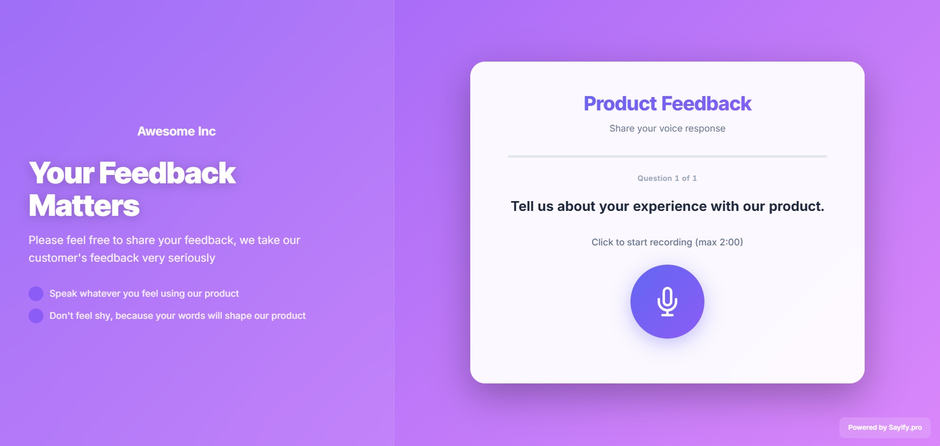
Here's what a typical intake page looks like:
🌐 How to Access It
Every intake link lives at a public URL like this:
https://your-subdomain.sayify.pro/i/your-custom-slug
For example, if your subdomain is acme and your slug is product-feedback:
https://acme.sayify.pro/i/product-feedback
💡 Tip: Share this URL anywhere — email, Slack, SMS, QR code, or embed it on your website. It works on any device, no app install required.
🚶 The Respondent Journey
Here's exactly what your respondents experience, step by step:
1. ✨ Loading Screen
A polished, animated loading screen appears while Sayify prepares the experience. It sets a professional first impression with smooth animations and your brand colours.
2. 👋 Welcome Screen
The respondent sees your form title and description — giving them context about what they're being asked and why it matters.
3. 📝 One Question at a Time
Questions are presented one at a time in a clean, focused layout. This keeps the experience calm and unrushed. A progress bar at the top shows how far along they are.
Depending on the question type, respondents will see:
| Question Type | What the Respondent Sees |
|---|---|
| 🎤 Voice | A big, friendly microphone button — tap to record, tap again to stop. They can re‑record as many times as they like. |
| ✏️ Text | A clean text input field. |
| 🎤✏️ Voice + Text | Choice between recording voice or typing — great for accessibility. |
| 📋 Multiple Choice | Polished selection cards to pick from. |
| 🔢 Number | A numeric input field. |
| A validated email input. | |
| 📅 Date | A date picker. |
| ✅ Yes / No | Two clear choice buttons. |
| 📎 File Upload | A drag‑and‑drop area or file browser. |
4. 🧠 AI Follow‑Up (Optional)
If you've enabled dynamic AI probing, something magical happens after a voice answer: the AI listens to what the respondent said and may ask a smart follow‑up question to go deeper. The respondent can answer or skip it — no pressure.
5. ⏳ AI Evaluating
Behind the scenes, Sayify's AI analyses each voice answer in real‑time — transcribing, detecting sentiment, and extracting topics. The respondent sees a subtle "evaluating" animation while this happens (it only takes a moment).
6. 🎉 Thank You Screen
After the last question is submitted, a success screen appears with your custom thank‑you message. If you've configured a redirect URL, the respondent is automatically sent there after a few seconds.
⚙️ Customising the Experience
You control how the intake page looks and behaves through your link settings and tenant branding.
Link‑Level Settings
These are configured when creating or editing an intake link:
| Setting | What it does |
|---|---|
| Title | The headline respondents see at the top of the page. |
| Description | Supportive context — explain what you're collecting and why. |
| Thank You Message | Custom message shown after successful submission. |
| Redirect URL | Automatically send respondents to another page after submission. |
| Require Email | Ask respondents for their email before or after responding. |
| Allow Anonymous | Let respondents submit without providing any identifying information. |
Tenant Branding
For a fully branded experience, configure these in Settings → Tenant Settings:
| Branding Option | What it controls |
|---|---|
| Brand Name | Your company or product name, shown in the header. |
| Logo | Your logo displayed at the top of the intake page. |
| Primary Colour | Applied to buttons, accents, and the progress bar. |
| Accent Colour | Used for gradients and secondary highlights. |
| Background Style | Choose a solid colour, gradient, or custom background image. |
| Font Family | Pick a typeface that matches your brand. |
| Button Style | Rounded, square, or pill‑shaped buttons. |
| Header Layout | Centered or left‑aligned header positioning. |
| Powered by Sayify | Toggle the "Powered by Sayify" badge on or off. |
🎨 Layout Templates
Sayify offers two layout templates for the intake page. You can choose the one that best fits your brand:
Centered Card (Default)
A clean, focused card centered on a vibrant gradient background. Best for simple, quick forms where you want respondents to stay focused on one thing at a time.
Hero Split (B2B Branding)
A two‑column layout with a branded hero section on the left (your headline, description, and trust bullets) and the form content on the right. Perfect for enterprise and B2B use cases where you want to reinforce credibility alongside the form.
The hero split layout supports additional customisations:
| Setting | What it does |
|---|---|
| Headline | Bold headline text in the hero area. |
| Subheadline | Supporting text below the headline. |
| Trust Bullets | A list of trust‑building points (e.g. "🔒 Your responses are private", "⏱️ Takes less than 2 minutes"). |
| Footer Text | Custom text at the bottom of the page. |
| Links | Add links to your privacy policy, terms, or website. |
💡 Tip: Choose your layout template in Settings → Tenant Settings → Collector Theme.
📱 Mobile‑Friendly & Embeddable
The intake page is designed to work beautifully everywhere:
- 📱 Fully responsive — Looks great on phones, tablets, and desktops. Voice recording works on all modern mobile browsers.
- 🖼️ Embeddable — The page auto‑detects when it's loaded inside an
<iframe>and adapts its layout accordingly. Embed it in your website, help desk, or intranet. - ⚡ Fast — Lightweight and optimised for quick load times, even on slow connections.
🛡️ Error Handling
Sayify handles errors gracefully so respondents are never left confused:
| Scenario | What the Respondent Sees |
|---|---|
| Link not found | A friendly "Link Not Found" page with a clear explanation. |
| Link paused/inactive | A message explaining the form is currently not accepting responses. |
| Network issue | Helpful inline notices with a prompt to retry. |
| Transcription trouble | An automatic fallback to text input — the respondent can type instead of re‑recording. |
| Submission error | Responses are still captured; the respondent sees a graceful completion. |
💡 Best Practices for Great Intake Pages
Here are some tips to maximise response rates and quality:
- Write a warm description — Tell respondents what you're collecting and why their input matters. People respond better when they feel heard.
- Keep it short — 3–5 questions is the sweet spot. Every extra question reduces completion rates.
- Lead with voice — Put your most important, open‑ended question first while respondents are freshest.
- Enable AI follow‑ups — Dynamic probing gets you 2–3× richer responses without adding more questions.
- Brand it — Adding your logo and colours makes the experience feel professional and trustworthy.
- Use a thank‑you redirect — Send respondents back to your website after submission for a seamless experience.
- Test on mobile — Most respondents will use their phones. Make sure it feels great.
🎓 What's Next?
- Templates — Browse pre‑built form templates for your industry.
- Inbox — Learn how to review and manage incoming responses.
- Alerts — Set up AI‑powered notifications for new feedback.
- Branding — Dive deeper into tenant branding customisation.
- Key Concepts — Review all platform building blocks.